Color Schemes For Outdoor Patios
Outdoor patios are extensions of indoor living spaces, offering opportunities for relaxation, dining, and entertaining. The color scheme chosen for an outdoor patio can significantly impact its ambiance and overall appeal. A well-chosen color palette can create a cohesive and inviting atmosphere, blending seamlessly with the surrounding landscape and enhancing the aesthetic appeal of the patio. Whether aiming for a serene oasis, a vibrant gathering spot, or a modern and minimalist retreat, understanding the principles of color theory and exploring various color schemes can guide the creation of an ideal outdoor sanctuary.
Monochromatic Color Schemes: Simplicity and Elegance
Monochromatic color schemes utilize variations of a single hue, creating a sense of unity and tranquility. Choosing a primary color, such as blue, green, or brown, and incorporating its lighter and darker shades, provides a harmonious and cohesive backdrop for the patio. For example, a cool blue patio can be achieved using shades of sky blue walls, light blue furniture, and navy blue accents. The use of white or cream can add brightness and contrast, while darker shades like charcoal or indigo can create depth and visual interest. Monochromatic schemes are particularly effective in creating a sense of calm and relaxation, as they offer a soothing visual experience.
Analogous Color Schemes: Harmony and Visual Interest
Analogous color schemes use colors that are adjacent to each other on the color wheel, such as blue, blue-green, and green. This combination creates a sense of harmony and visual interest, as the colors blend seamlessly and complement each other naturally. For example, a patio with a green theme could incorporate shades of lime green, emerald green, and teal, creating a vibrant and refreshing ambiance. The use of neutral colors like beige or white can balance the vibrancy of the analogous colors, while accents of yellow or orange can add pops of energy and warmth.
Complementary Color Schemes: High Contrast and Visual Excitement
Complementary color schemes use colors that are opposite each other on the color wheel, such as blue and orange, red and green, or yellow and purple. The high contrast between these colors creates a dynamic and visually exciting atmosphere. When using complementary colors, it's important to maintain balance and avoid overwhelming the space. For example, a patio with a red and green scheme could feature red patio furniture and green plants, with white walls and neutral-toned accents to balance the strong colors. Complementary color schemes are often used for bold and statement-making designs, as they create a striking visual impact.
Neutral Color Schemes: Timeless Elegance and Versatility
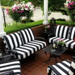
Neutral color schemes rely on a base of white, black, gray, beige, or brown, creating a timeless and elegant ambiance. These colors provide a versatile backdrop for diverse furniture styles, decorative elements, and plant choices. To prevent a neutral scheme from being too bland, incorporating pops of color through accents like cushions, throws, and plants can add vibrancy and personality. For example, a beige patio with white furniture can be enhanced with pops of turquoise or fuchsia in cushions and decorative elements. Neutral color schemes offer a clean and sophisticated look that complements various design styles.
Warm Color Schemes: Inviting and Cozy Atmosphere
Warm color schemes, incorporating reds, oranges, yellows, and browns, create an inviting and cozy atmosphere. These colors evoke feelings of warmth, comfort, and hospitality. For example, a patio with terracotta walls, orange furniture, and yellow accents can create a welcoming and inviting ambiance. Warm colors are particularly well-suited for patios that are used for dining and entertaining, as they promote a sense of togetherness and celebration.
Cool Color Schemes: Tranquil and Serene Atmosphere
Cool color schemes, including blues, greens, and purples, create a tranquil and serene atmosphere. These colors evoke feelings of peace, relaxation, and tranquility. For example, a patio with blue walls, green plants, and purple accents can create a calming and peaceful environment. Cool colors are often used for patios that are intended for relaxation and contemplation, as they promote a sense of calm and serenity.
Consider the Surroundings
When choosing a color scheme for an outdoor patio, it's crucial to consider the surrounding environment. The colors of the house, the landscape, and the existing vegetation can influence the overall design. If the house is painted in a warm color, using cool colors on the patio can create a balanced and harmonious look. Similarly, incorporating colors that complement the surrounding greenery can enhance the natural beauty of the outdoor space.
Embrace Personal Style
Ultimately, the best color scheme for an outdoor patio is one that reflects the personal style and preferences of the homeowner. Whether you prefer a classic, modern, or eclectic look, there is a color scheme that can enhance the beauty and functionality of your outdoor space. Experimenting with different colors and textures can help you create a patio that is both aesthetically pleasing and personally meaningful.

6 Best Outdoor Patio Color Schemes To Consider Werever Cabinets

Chose The Best Color Scheme For Your Patio With Examples

6 Best Outdoor Patio Color Schemes To Consider Werever Cabinets

Pin Page

7 Striking Summer Color Combos For Your Outdoor Room

5 Outdoor Home Decorating Color Schemes And Patio Ideas For Summer

Outdoor Living Color Schemes Houston Designers Offer Ideas
:strip_icc()/101590304-7f8bcc61dede498fbcf410fa0f0a45ac.jpg?strip=all "15 Patio Design Tips For A Charming Outdoor Space")
15 Patio Design Tips For A Charming Outdoor Space

Outdoor Patio Color Schemes To Revitalize Your Space

Three Vibrant Color Schemes For Outdoor Spaces Decoist